CSS Grid Concepts
Learning objective: By the end of this lesson, students will understand CSS Grid as a versatile layout tool, capable of handling complex web designs with multi-column layouts, responsive design, and interactive UI components.
The revolution of CSS Grid
CSS Grid emerged as a game-changer in web design, offering a two-dimensional system for precise element alignment and layout control. It replaced older, less flexible methods like floats and positioning, revolutionizing web page layouts.
Why choose CSS Grid?
- Ease of use: Grid’s straightforward syntax simplifies layout creation.
- Responsive design: Easily adapt layouts for different screens using media queries.
- Accessibility: Pairing Grid with semantic HTML enhances user accessibility.
- Clean code: Grid reduces code complexity and increases maintainability.
- Versatile layouts: From multi-column to complex structures, Grid handles it all.
Ideal use cases for CSS Grid
- Multi-column layouts: Effortlessly create layouts with multiple columns and sidebars.
- Complex page structures: Manage intricate designs, nested grids, and dynamic content.
- Responsive websites: Build layouts that fluidly adjust to various screen sizes.
- Interactive UI components: Ideal for menus, modals, and carousels.
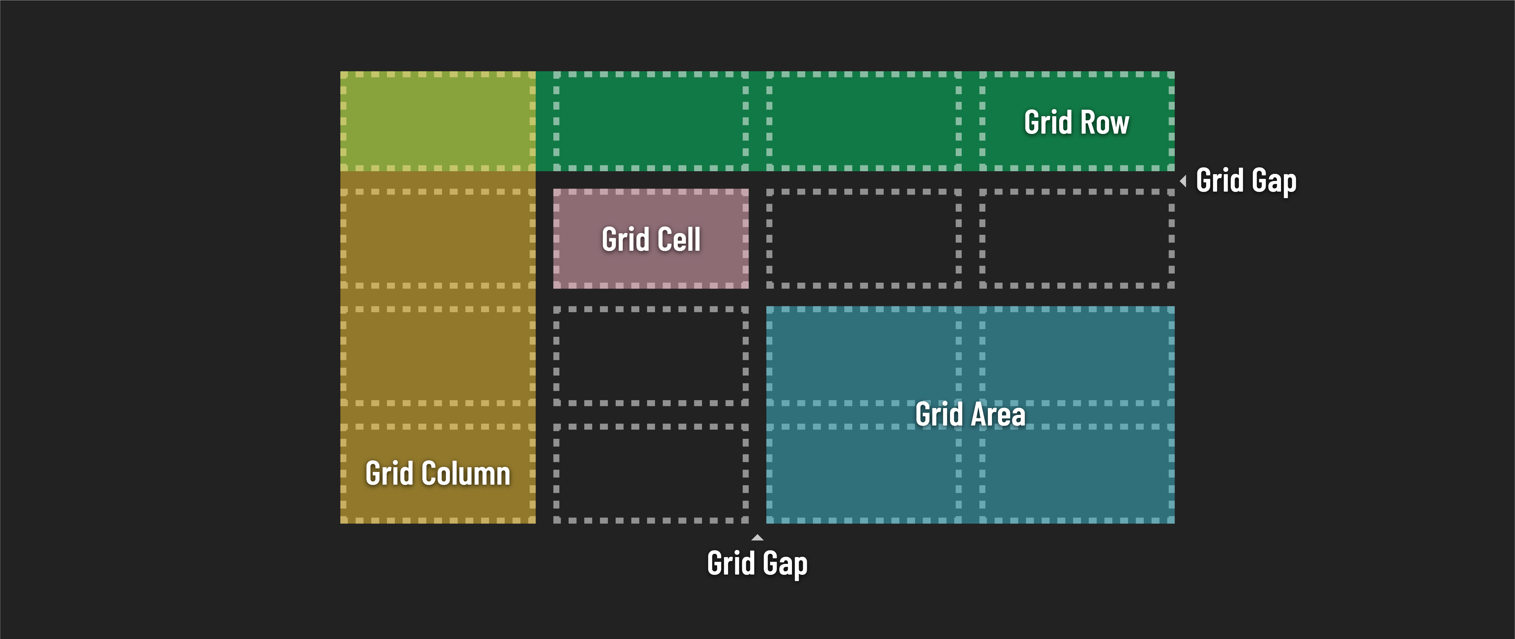
- Controlled white space: Maintain consistent spacing and dedicated blank areas with grid gap.
Let’s dive in!