HTML Forms Accessibility in Web Forms
Learning objective: By the end of this lesson, students will understand how labels and placeholders differ in accessibility.
Accessibility pitfall: misuse of the placeholder attribute
We’ve already discussed the accessibility benefits of labeling inputs when working with web forms. Let’s examine some of the pitfalls that come along with a commonly used alternative: placeholders.
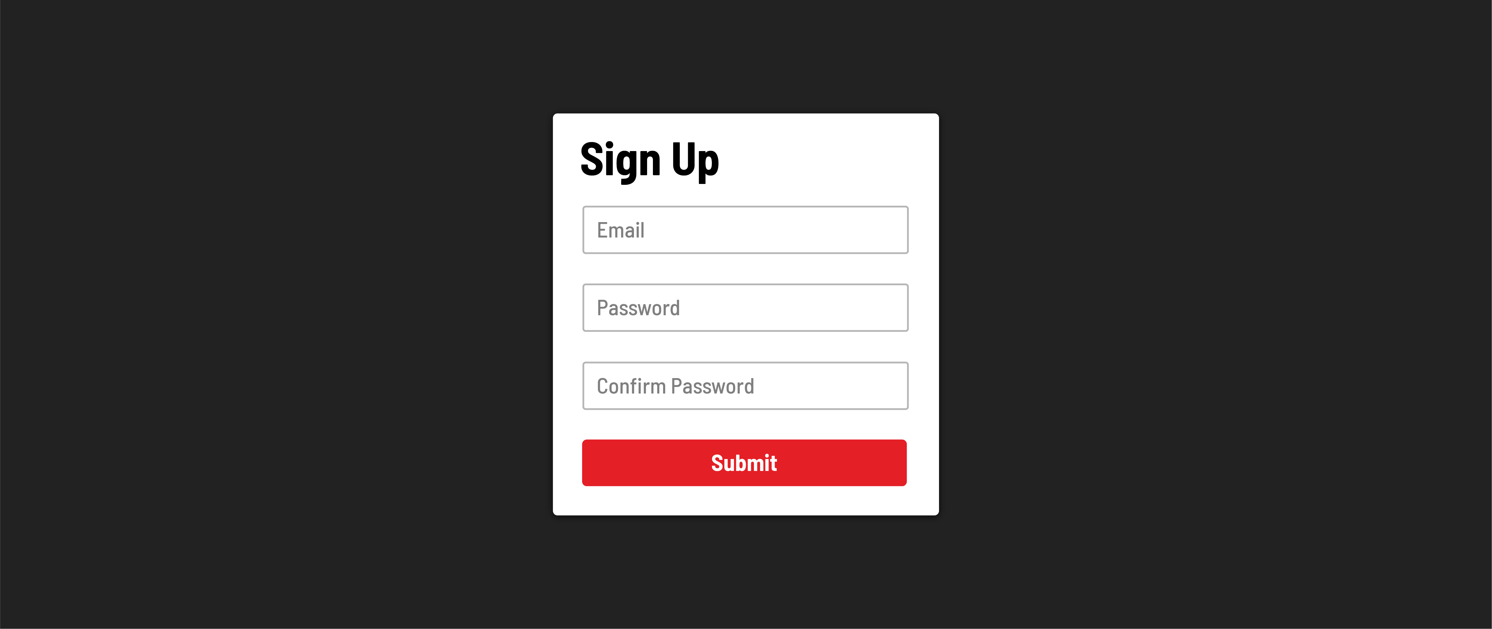
While visual minimalism can be tempting, placeholders should not be used instead of labels.
The primary reason is that because placeholders are attributes, they are skipped over by browser translators. <label> elements wrap text, which can be translated safely, but placeholders inject text as code. This code is ignored during translation. You can imagine why - if a browser started translating parts of code into other languages, the code itself would break.
Accessibility pitfall: vanishing instructions
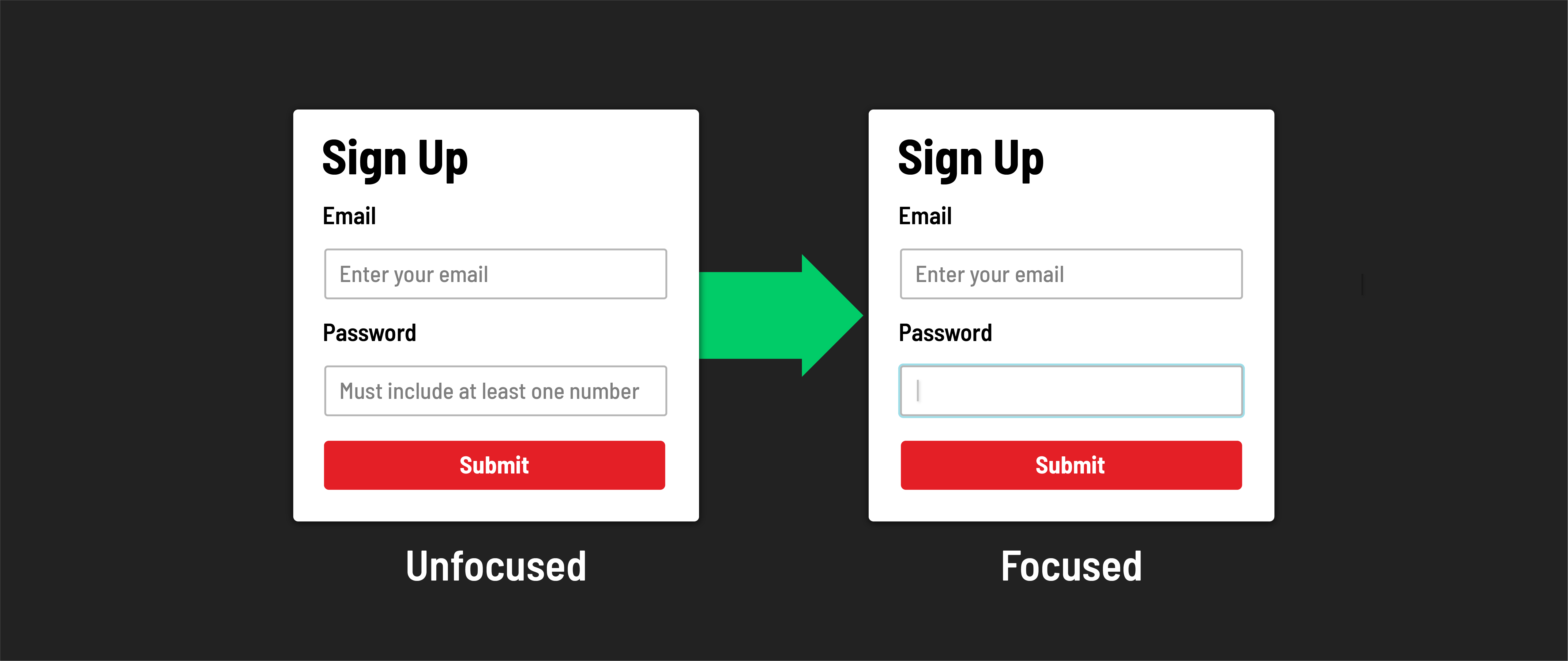
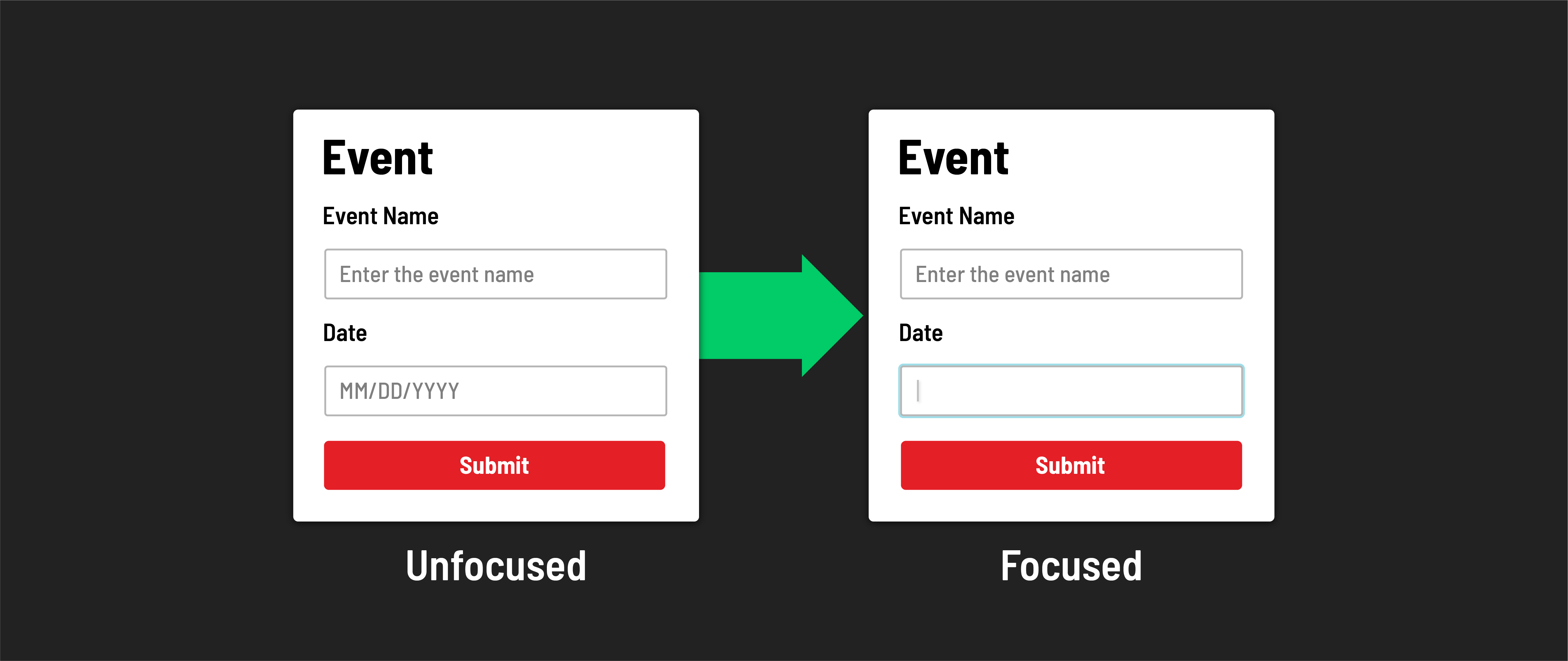
When a user starts typing in an input field, the placeholder text disappears, taking any hints or instructions with it. It’s important to consider how this impacts the cognitive accessibility of your app.
This behavior negatively impacts the experience of individuals who struggle with recall, and even those that don’t. This includes a wide range of people, such as those with short-term memory loss or ADHD, or even users that get sidetracked while filling in a form and come back later to finish. Placeholders add friction for those who may struggle to remember the information the field requires.
Accessibility pitfall: one box, two meanings
When considering different levels of digital literacy among users, it’s crucial to recognize that placeholder text might be misleading for some. To certain individuals, especially during a quick scan, an input field with placeholder text might appear already filled. This can unintentionally lead users to overlook these fields, causing frustration when they realize they’ve excluded necessary information.
To make forms more accessible, place any details about the content or requirements of an input field in a clear and accessible position. Ideally, this information should be situated above the input field itself and below its corresponding label. This way, it can be referenced or translated, and we remove any ambiguity about whether the input is empty.
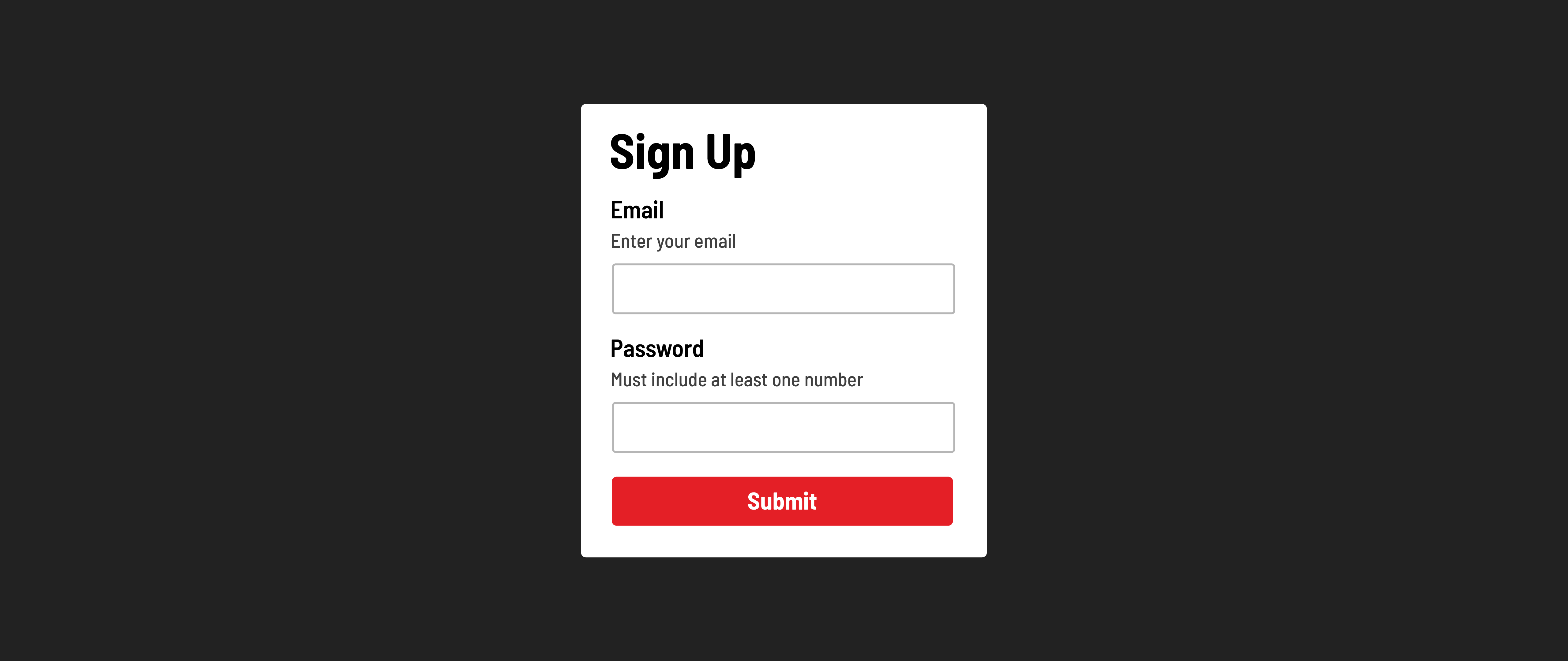
Making our form more accessible
Let’s help increase the accessibility of our form by telling our users which fields are required and which are not before they submit their form. All our fields are required in our case. Let’s add a <div> element with some small print between each label and its corresponding input.
<h1>Contact Form</h1>
<form action="/the-form-submits-here" method="POST">
  <div>
    <label for="name"> Name: </label>
    <div><small>required</small></div>
    <input type="text" id="name" />
  </div>
  <div>
    <label for="email">Email:</label>
    <div><small>required</small></div>
    <input type="email" id="email" />
  </div>
  <div>
    <label for="message">Message:</label>
    <div><small>required</small></div>
    <textarea id="message"></textarea>
  </div>
  <button type="submit">Submit</button>
</form>
Note that there is visual work we could do with this form to make it even more accessible to sighted users - refer to the assets above for some potential styling inspiration for your forms. In particular, pay attention to the spacing between elements and how visual grouping can help bundle an input and the details about an input.