React Components Building and Using Components
Learning objective: By the end of this lesson, learners will be able to understand and implement the concept of component nesting in React.
Building our first component
Now that we have explored our sample markup let’s move the first half into our React app and start creating some components. We’ll start with the nav bar. It’s a common UI element found on almost every web page, perfectly illustrating the concept of a reusable and distinct component.
Examining the nav code
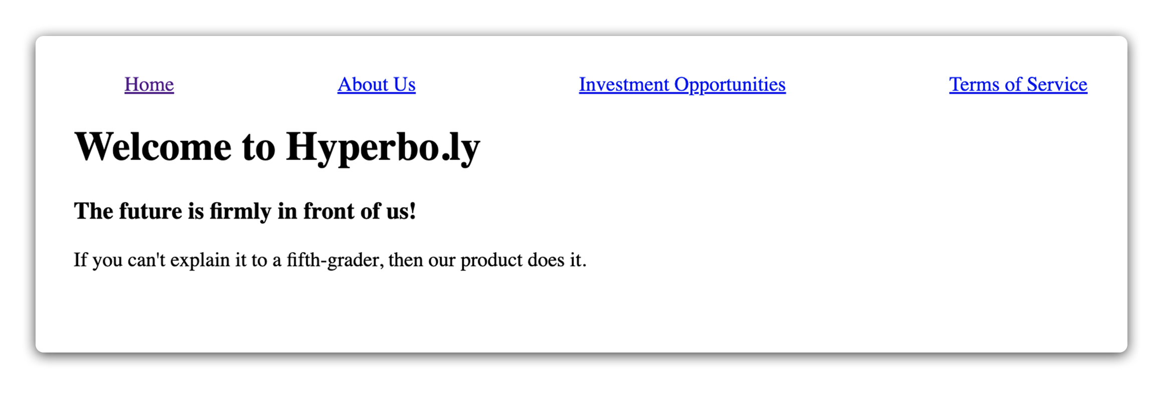
Let’s look at the sample website markup again, this time as JSX code in our main App component.
Add the following in App.jsx:
// src/App.jsx

import './App.css';

const App = () => {
  return (
    <>
      <nav id="top-navbar">
        <a href="/">Home</a>
        <a href="/about-us">About Us</a>
        <a href="/money-pit">Investment Opportunities</a>
        <a href="/the-fine-print">Terms of Service</a>
      </nav>
      <main>
        <h1>Welcome to Hyperbo.ly</h1>
        <h2>The future is firmly in front of us!</h2>
        <p>If you can't explain it to a fifth-grader, our product does it.</p>
      </main>
    </>
  );
};

export default App;
Here, we have nested a <nav> JSX element and some fake navbar items.
Clear default CSS
Next, let’s delete the contents of both App.css and index.css. This will remove the default styling and give us a clean slate.
Add the following back to index.css:
/* src/index.css */

#top-navbar {
  display: flex;
  justify-content: space-around;
}
This will give our links some breathing room. You should see the following in your browser when you run the app:
Now that we have some starting markup, we can split it into components.
Splitting the Navbar
The code we want to split off is bundled up nicely inside the single <nav> element. This makes modularizing it into a separate component a quick operation.
First, we’ll make a components directory inside the existing src directory:
mkdir src/components
Next, let’s create a new Navbar directory inside the new components directory:
mkdir src/components/Navbar
Finally, we’ll create a Navbar.jsx file for this component inside the new Navbar directory.
touch src/components/Navbar/Navbar.jsx
♻️ Repeatable pattern: when adding a new component to a project, we’ll follow a pattern similar to what we’ve just done. We’ll start with a directory matching the component’s name inside of the
componentsdirectory. After we’ve created that we’ll make a.jsxfile with an identical name.Any files belonging to this component (such as styling) should be added to this same directory. Note that React doesn’t require us to follow this convention. It’s just a pattern we’ll follow as we build our applications to keep our work somewhat organized.
Though it might seem unconventional in JavaScript to capitalize file names, React follows the practice of capitalizing both file and function names of components.
Next, we’ll add our React component in the Navbar.jsx file and export it.
Remember, React components are just functions that return JSX. Let’s begin by creating a function:
// src/components/Navbar/Navbar.jsx

const Navbar = () => {};
Right now, this function doesn’t return anything. Our objective is to make the Navbar component return the <nav> element currently in the App.jsx file. We’ll achieve this by transferring the entire <nav> element into the Navbar component as its return value:
// src/components/Navbar/Navbar.jsx

const Navbar = () => {
  return (
    <nav id="top-navbar">
      <a href="/">Home</a>
      <a href="/about-us">About Us</a>
      <a href="/money-pit">Investment Opportunities</a>
      <a href="/the-fine-print">Terms of Service</a>
    </nav>
  );
};
The final step is adding the export statement. This enables the component to be used in other parts of the application through the import statement.
To complete our Navbar.jsx file, ensure you’re exporting the component at the end of the file:
// src/components/Navbar/Navbar.jsx

export default Navbar;
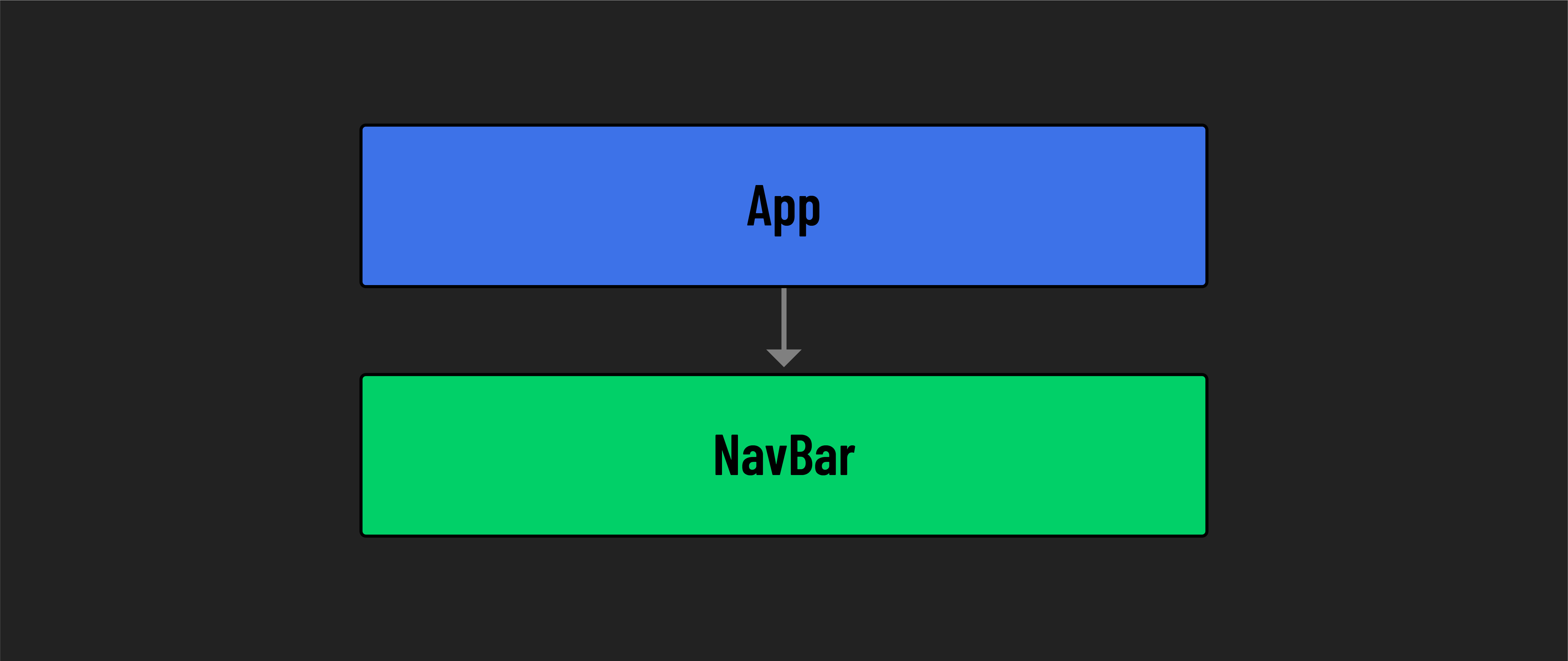
Importing the Navbar into the App
Now that we’ve created a Navbar component, let’s import it into our App.jsx file. Add the following statement to the top of App.jsx:
// src/App.jsx

import Navbar from './components/Navbar/Navbar.jsx';
To include the Navbar component in our JSX, we can insert it into the markup like a standard HTML element <Navbar></Navbar> or simply <NavBar />.
🧠 React components rarely need any content between their opening and closing tags, so a common React convention is to use the self-closing tag shortcut:
<Navbar />
Let’s place our new component above the <main> element, where the <nav> element used to be:
// src/App.jsx

const App = () => {
  return (
    <>
      <Navbar />
      <main>
        <h1>Welcome to Hyperbo.ly</h1>
        <h2>The future is firmly in front of us!</h2>
        <p>If you can't explain it to a fifth-grader, our product does it.</p>
      </main>
    </>
  );
};
Nice! Check back in the browser, and you should see the site restored to its original look, only now with components working together to make it happen. And with that you’ve just built your first user-defined component!
Component-specific CSS
As you dive deeper into React, you’ll encounter more advanced techniques for styling components. But for now, we’ll keep things simple by creating a separate .css file for each component. Treating components as modular units isn’t just about the JavaScript code – it extends to their styling too. This approach means giving each component its own .css file.
Go ahead and move the CSS code for the navbar from index.css to a new file, Navbar.css. This file should be placed in the same directory as the Navbar.jsx file in your project’s structure.
Next, add an import statement to the top of your Navbar.jsx file that imports the Navbar.css style sheet:
// src/components/Navbar/Navbar.jsx

import './Navbar.css';
You might hope this setup means your styles are locked down to just the Navbar component. That would be helpful, but the CSS here is still global. That means styles in Navbar.css could affect other parts of your app where similar CSS selectors are used.
This doesn’t mean that per-component CSS like this isn’t worthwhile. Bundling our code in this way for organization purposes is still a plus and keeps us from writing all our CSS in a single file for our whole app. It also builds good practice for when we eventually contain the CSS in a file to a single component.
Ensure your CSS rules are targeted specifically at the Navbar to ensure there is no overlap with any other element. For example, use an id or class unique to the Navbar. This is a good practice to ensure your styles don’t start affecting other elements unexpectedly.