React Components Concepts
Learning objective: By the end of this lesson, learners will understand the foundational concept of React as a component-based framework.
React is components
Ask any React developer what the primary feature of React is, and there’s a decent chance they’ll answer “components”.
Breaking down front-end code into smaller, distinct pieces might not appear groundbreaking at first glance. However, once you start using React components, you’ll find that this approach can profoundly shift your perspective on creating and maintaining front-end applications.
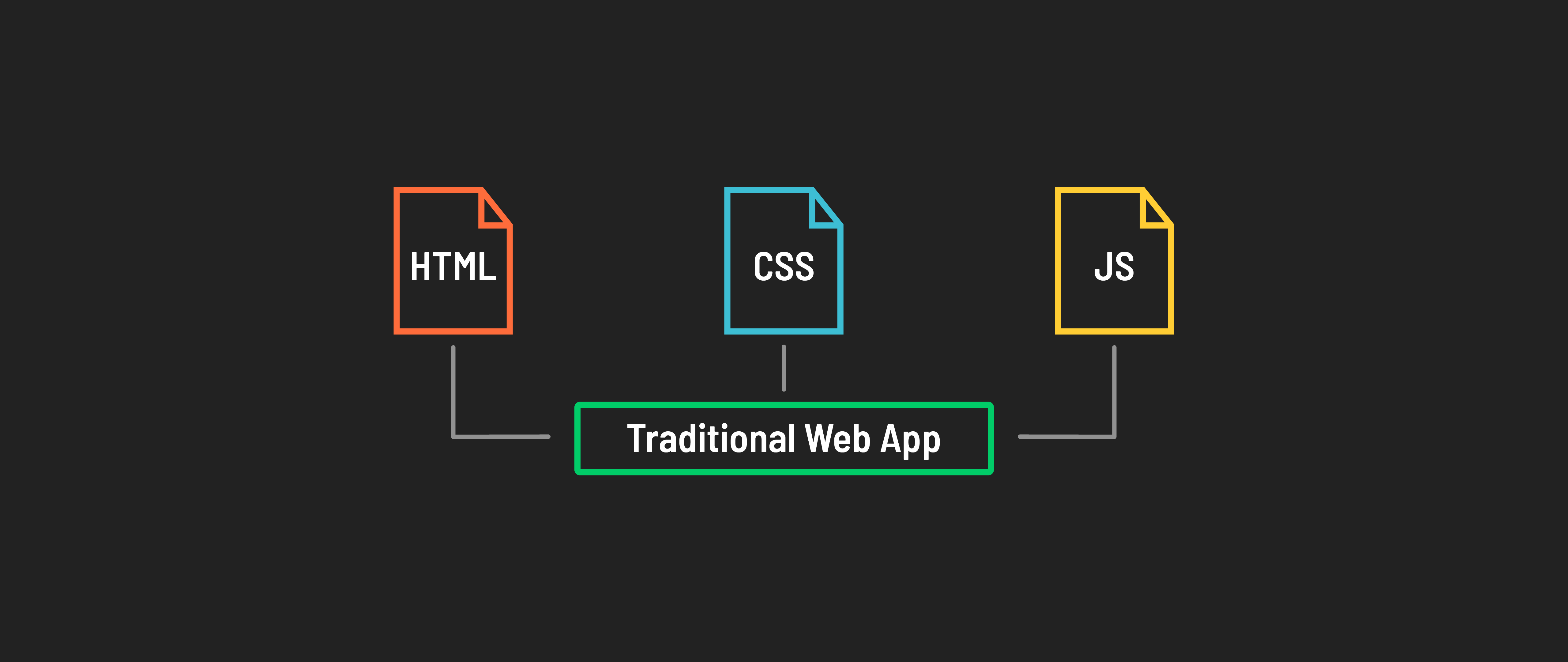
To understand this, let’s contrast how traditional HTML, CSS, and JavaScript applications are structured compared to React applications.
Page vs. component architecture
Traditional web applications typically separate HTML, CSS, and JavaScript into distinct files – HTML for structure, CSS for styling, and JavaScript for interactivity. These web apps tend to have a more monolithic structure, where large chunks of code are written in just a few files.
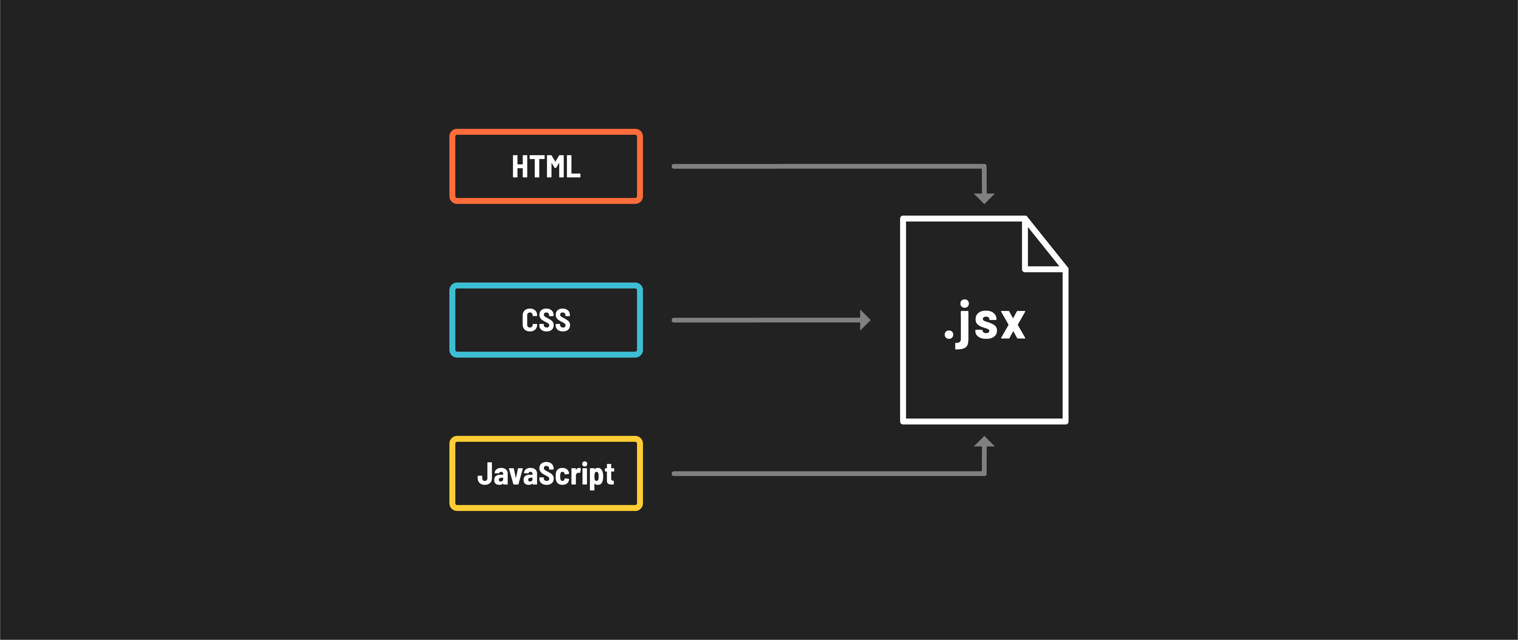
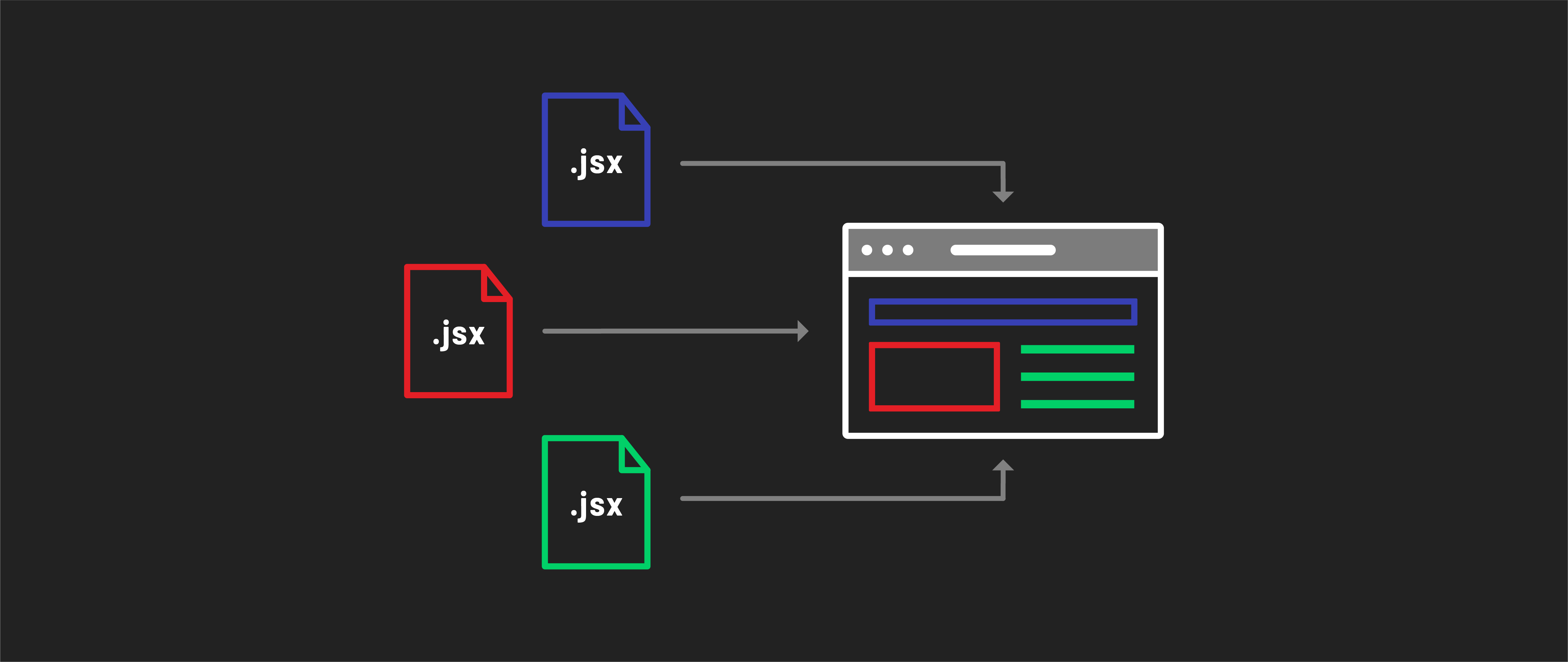
In React’s more modular approach, these technologies are often combined. In a React app, the UI is broken down into components, each defined in a separate JSX file. JSX allows combining HTML structure, CSS styles, and JavaScript logic in a single file for each component.
Each React component encapsulates a specific element or a closely related group of elements, each serving a singular purpose - like a button, form, or navigation bar.
Learning to think in components
Think of components as the Lego blocks of your application’s user interface. Each component is a self-contained piece that can be reused and combined in different ways to build complex UIs. This modularity makes developing, maintaining, and scaling apps easier.
Components promote reusability. You can create a component once, like a button or a user profile card, and use it in multiple places in your app. This reduces code duplication and leads to more efficient development.
React components are best designed to act like pure functions, focusing on a single task or feature. They should operate independently, without relying on other components. This approach ensures each component fulfills one specific purpose within the application. Components should have consistent and predictable UI output for a given input.
Components communicate with each other using props (short for properties). Props allow you to pass data from parent components down to child components. This one-way data flow keeps the component structure predictable and easy to debug.
Because components are isolated, they can be developed and tested independently, making debugging easier. If an issue arises in one part of your app, you can trace it back to a specific component, simplifying the troubleshooting process.
Your application is a tree
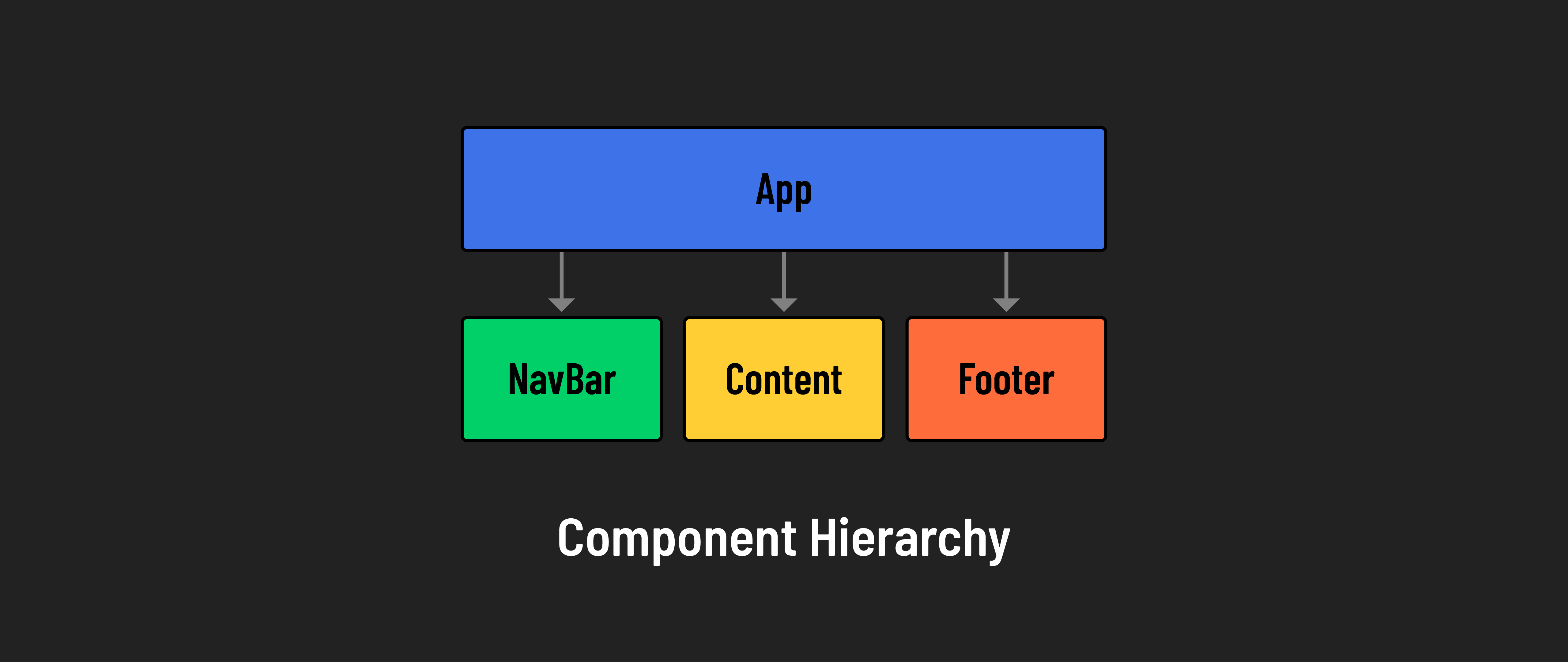
In the tree structure of a React app, components form a hierarchy. You have parent components and child components. This hierarchy is important because it defines the flow of data and the relationship between different parts of your application. For example, a Navbar component might have child components like NavItem or DropdownMenu.
Components for collaboration
Working in components is great for collaboration in teams of all sizes. For one, the self-contained nature of components makes contributing to projects easier than managing a whole team’s ongoing changes to large files that may impact many parts of an app or website.
Components can also be shared across features, teams, and projects. If you work for a company that has a specific UI for a form component, different developers can simply reuse the component without having to build it again from scratch.