React Components Structuring Components in React
Learning objective: By the end of this lesson, students will be able to identify potential components within a web page’s layout and understand how to structure these components effectively in a React application.
Creating a component structure
Let’s explore how to identify and structure components for a basic web page.
Identifying components in a web page
A website’s layout often contains various sections that can be effectively organized as components. Here are a few tips on how to identify potential components:
- Reusability: Components are ideal for sections of code that appear multiple times. Components are meant to be reusable, so consider creating a component if you notice repeated patterns. For example, a submit button.
- Dynamic content: Sections that frequently receive changing data are perfect candidates for components. This includes dynamic sections where content might be swapped on a schedule or depending on the user. For example, a list of posts.
- Like functionality: Groups of elements that function together, are dependent on each other, or might be styled the same way could be grouped into a single component. For example, a nav bar or a form.
- Same purpose: If a set of elements serves a collective purpose or feature, it makes sense to encapsulate them in a component. For example, a call to action that aims to drive traffic to specific parts of an app, such a sign-up or purchase page.
Analyzing a web page
Let’s examine the markup for a web page and determine what component-based structure makes the most sense.
Hyperbo.ly
This is the landing page for Hyperbo.ly, a super-hot tech start-up making unbelievable progress in every field you can name: health, AI, VR, Crypto, NFTs - if it’s confusing and exciting, it’s Hyperbo.ly!
Don’t bring this code into your app. Just observe its structure.
<nav id="top-navbar">
  <a href="/">Home</a>
  <a href="/about-us">About Us</a>
  <a href="/money-pit">Investment Opportunities</a>
  <a href="/the-fine-print">Terms of Service</a>
</nav>
<main>
  <h1>Welcome to Hyperbo.ly</h1>
  <h2>The future is firmly in front of us!</h2>
  <p>If you can't explain it to a fifth-grader, our product does it.</p>
</main>
<h2>Our Founders</h2>
<ul>
  <li>
    <h3>Elizabeth Holmes: CEO</h3>
    <p>MBA from SuperLegit University</p>
  </li>
  <li>
    <h3>Sam Bankman-Fried: CFO</h3>
    <p>CPA from TotallyReal State</p>
  </li>
  <li>
    <h3>Matt Damon: CMO</h3>
    <p>Was in that Movie You saw</p>
  </li>
</ul>
Modularizing hyperbo.ly into components
When deciding how to divide your application into different components, imagine you’re looking at a wireframe sketch of your site. Where would you naturally draw the lines to separate different sections? This approach helps identify distinct areas that can function independently. Also, consider the reusability of these sections across various pages.
Breaking a page into components
Based on the markup, there are three clear divisions on this page.
<nav>...</nav>
<main>...</main>
<ul>...</ul>
Component structure won’t always follow markup structure exactly, but it can give us clues about which items are grouped by purpose or functionality. If we consider the elements on this page, two stand out as great candidates for components:
- The
<nav>bar: This section, containing links, has a distinct purpose and will likely be reused on multiple pages, making it an ideal component. It is a cohesive unit that will probably share a set of styles. - Founder
<li>elements: This list’s repeated pattern of individual entries indicates a strong use case for components. Each list item shares a similar UI structure but with different content.
Creating a component hierarchy
Let’s see how this markup might be translated into a component hierarchy diagram.
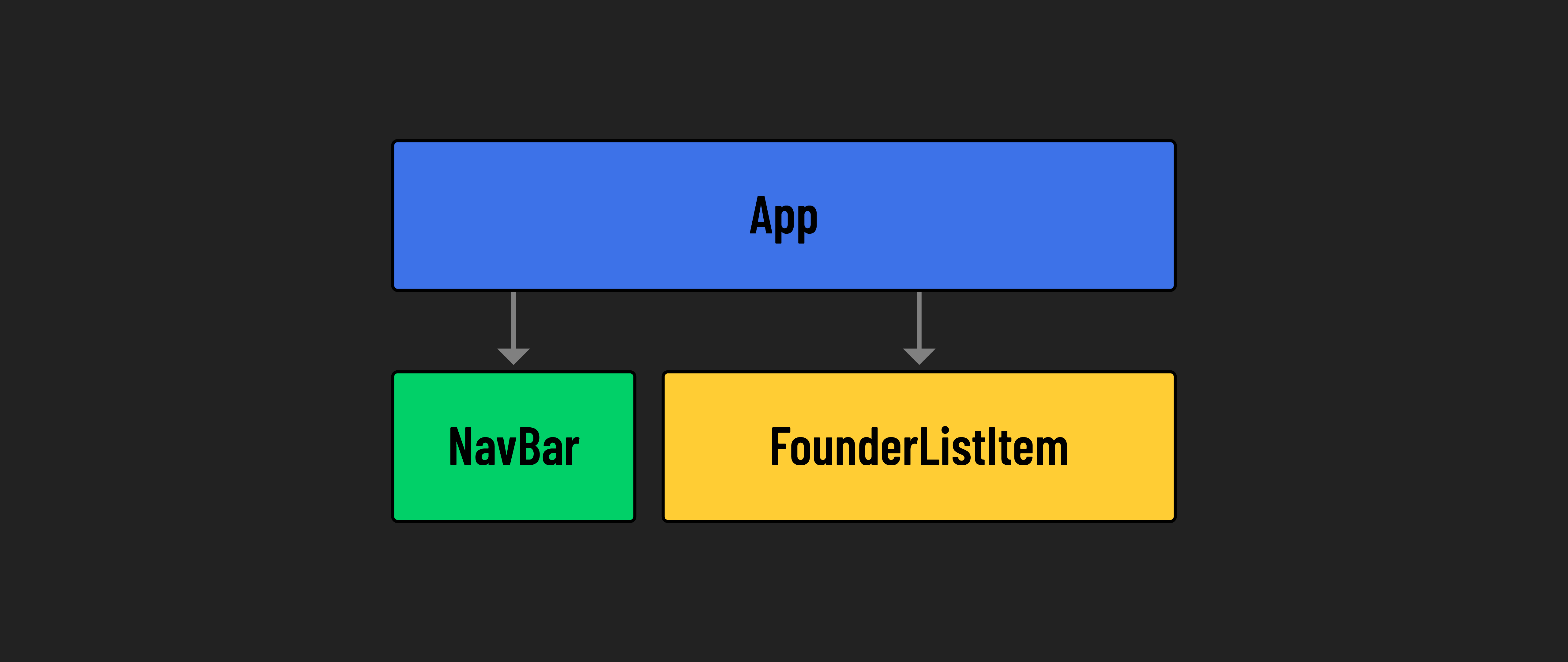
The App component serves as the parent or root of our component hierarchy. It contains two distinct child components: Navbar and FounderListItem. Each of these child components should be represented by its own dedicated file.
This separation allows for more organized code management, with each component having individual JSX and CSS files.